The Month’s Most Disastrous Rebrand: Cracker Barrel’s Logo Overhaul Backfires Spectacularly

In a bold yet ill-fated move, the American family restaurant chain Cracker Barrel has executed what may be the most unsuccessful rebranding of the month.

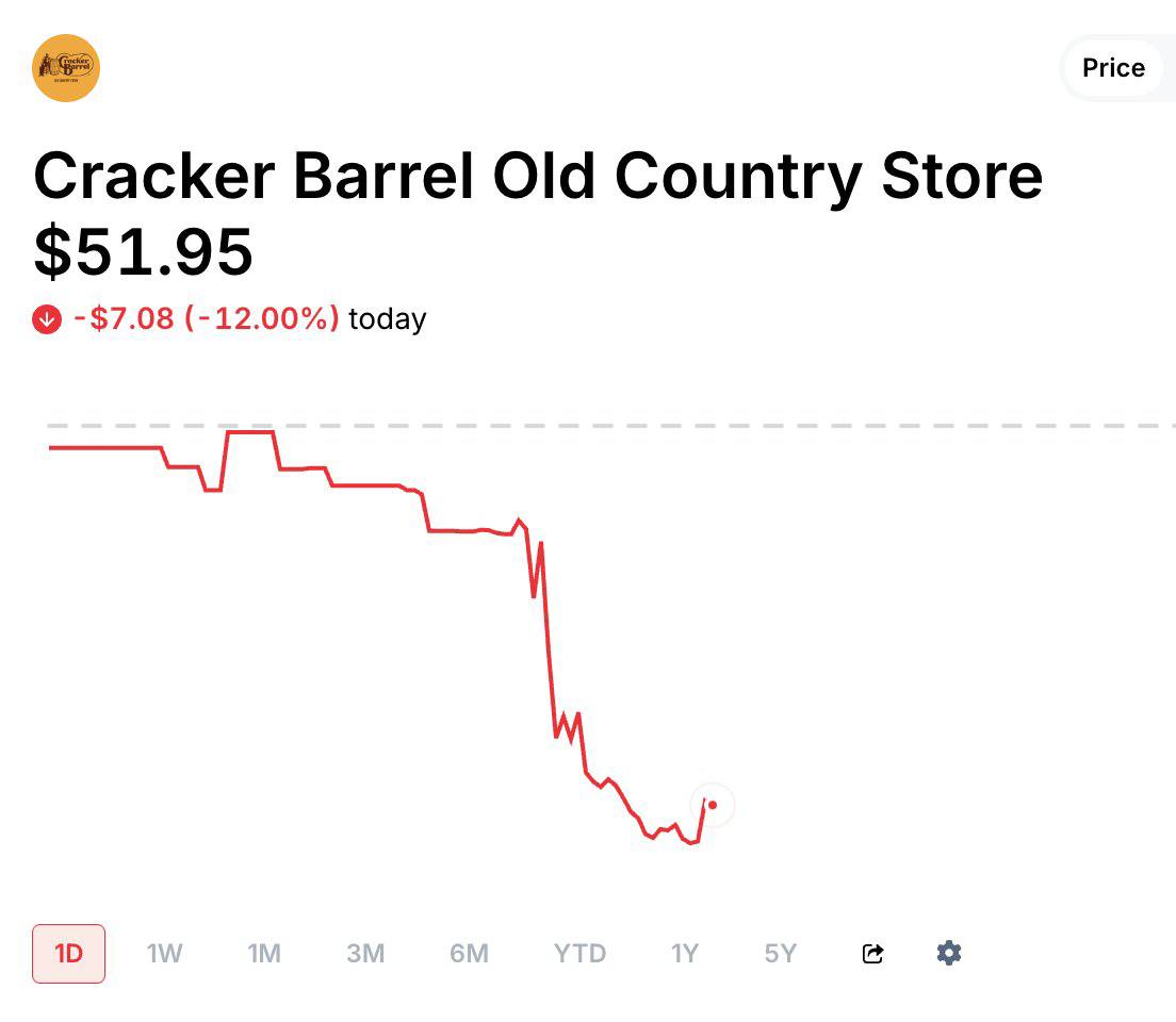
The decision has sparked widespread backlash, flooded social media with memes, triggered a 12% drop in stock prices, and shaved $200 million off the company’s value in a single day.
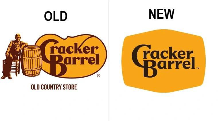
The rebrand, intended to modernize the chain’s image, replaced the nostalgic imagery with a minimalist design, focusing solely on the brand name within a simplified barrel outline.
However, this departure from tradition has alienated long-time customers who associate the original logo with the rustic, homestyle charm that defines Cracker Barrel.
The removal of the grandfather figure and the barrel’s prominent role has been met with accusations of erasing the brand’s heritage, with critics arguing that the new design lacks soul and fails to tell the company’s story.
Social media platforms, particularly X, have become a battleground of discontent, with users unleashing a torrent of memes mocking the change.

This misstep underscores the risks of embracing minimalism at the expense of a brand’s established identity. While some companies successfully pivot with sleek, modern redesigns, Cracker Barrel’s attempt has highlighted the importance of preserving core elements that resonate with its audience. As of now, the company has yet to announce a reversal, but the overwhelming criticism suggests that pressure may mount for a return to the classic logo—or at least a compromise that honors its roots.

- Quentin Tarantino Unveils Details on New Film The Adventures of Cliff Booth Starring Brad Pitt
- Twitter Unveils List of Self-Made Billionaires with Below-Average Height, Featuring Three of the World’s Richest
- Wi-Fi Signals Can Measure Heart Rate: A Revolutionary Breakthrough
The Cracker Barrel rebranding serves as a cautionary tale in the ongoing debate over minimalism in branding, proving that sometimes, less is not more when it comes to maintaining customer loyalty and market stability.