What is a Neutral Color Palette

Hello!
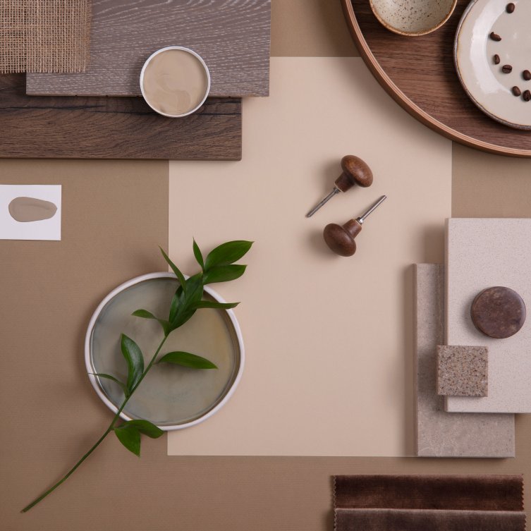
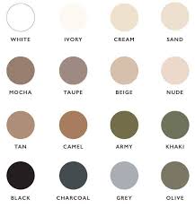
A Neutral Color Palette is a range of colors that are considered to be relatively lacking in saturation. Neutral colors include black, white, gray, brown, taupe, ivory, and beige. These colors tend to be calming and soothing and pair well with both vibrant and more muted hues.
The neutral colors can also act as a bridge between two colors that don’t look good together on their own. As neutral paint colors provide a blank canvas, they can create virtually any kind of atmosphere for a room.
Just as the barely pink intermingle nicely with the soft green, a Neutral Color Palette allows an almost limitless combination of colors to be used. It includes shades that are considered neither warm nor cool. Neutral colors can be used to create sophisticated, timeless spaces or even more vibrant, modern looks.
Why Use a Neutral Color Palette?
There are many reasons to use a neutral color palette in your home. Let’s read about the benefits of using neutral colors:
Provide a calming and soothing atmosphere
When used in the home, neutral colors can provide a calming atmosphere that helps to reduce stress. This is why they are often used in bedrooms and living rooms – to help you relax and unwind. When the neutral color scheme is used, it can create the feeling of an open and calming space. The neutral tones reflect light and help make a room feel brighter.
They are timeless

Neutral colors can also be used as a backdrop for bolder and brighter accent pieces, which can easily be updated should your tastes change.
Suppose you use pink hues in your living room that are too distracting for the eye. In this case, using neutral colors provide a balanced look with some touches of vibrant hues.
They go with everything
Due to their timelessness, neutrals are incredibly versatile and look great when mixed and matched. They can create a cohesive look across an entire home when different furniture and decor in the same neutral tones are combined.
When varying shades of a neutral color palette are used in the same space, it can create visual interest and texture without being too distracting or overwhelming. In addition, neutral colors can be combined with other colors to create an elegant and stylish look. This versatility makes them a great option for small and large spaces.
They can make a space feel larger
They can be used to make a bold statement
Although neutrals are typically seen as subtle and subdued, they can also be used to make a bold statement. Using varying shades of the same hue or combining different neutrals together makes it possible to create an eye-catching and interesting look that stands out from the crowd.
For example, popping in a few beautiful pieces of furniture with vibrant neutral tones is an excellent way to add drama and flair to a room. When the primary accent color is neutral, it can make the space feel inviting yet still bold and unique.
Drawbacks of Neutral Color Palettes
However, there are some drawbacks to using a neutral color palette in the home. Let’s take a look at some of them.
Neutral color palettes can be boring and lack personality
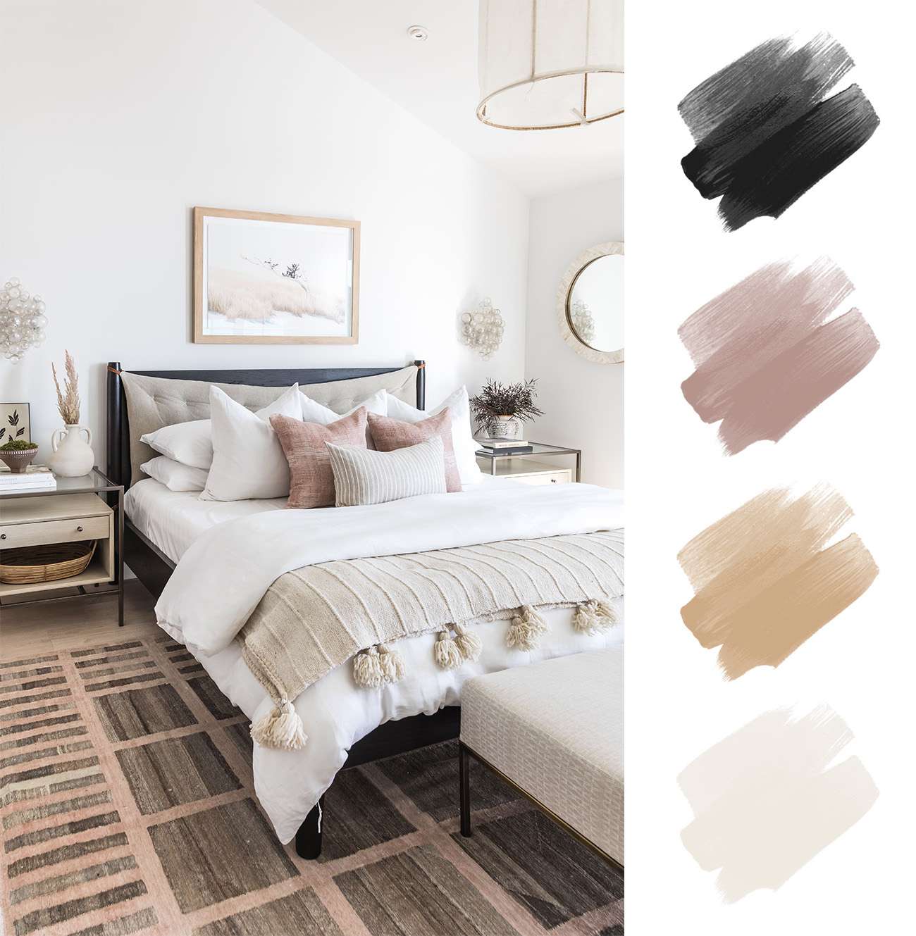
As a result, the home can look bland and lack personality.
This is especially true for those who prefer more vibrant color schemes. Suppose you have just moved into a new home entirely decorated in neutrals. It can be quite challenging to create an interesting and inviting interior.
Or, perhaps you’re trying to freshen up a room, but adding more neutrals doesn’t make it look exciting.
Even when you add variations of the same color, such as beige, cream, and ivory, the result can still look dull.
It may not be suitable for smaller spaces
Adding too much neutrality can make the room feel cramped and claustrophobic if you have a small room, such as a bathroom or bedroom. It is best to choose lighter, brighter colors for these smaller spaces.
When dark neutrals such as navy, charcoal, and black are used in small spaces, they can absorb too much light and make the room feel smaller. Or when neutral walls are paired with dark furniture, it can create a heavy atmosphere.
Neutral color palettes don’t go well with statement pieces
If you love to make a statement with your furniture and décor, then neutral color palettes may not be the ideal choice. This is because they tend to be quite muted and subtle, so there is less emphasis on any bold pieces. Neutral walls can also wash out vibrant statement pieces, making them dull and unappealing.
It can be too safe for some people’s tastes

Some people prefer more daring shades of yellow and pink or bold patterns on the walls.
Neutral can be difficult to coordinate
Finally, neutral color palettes can be tricky to coordinate as there are many subtle nuances in shades and tones of the same color.
You may think that all whites look the same, but if you take a closer look, it is easy to spot the differences. For example, some whites may look blue, while others look creamy or yellow. This makes it difficult to match different neutral colors and can lead to a mismatch of tones that doesn’t look good together.
Types of Neutral Color Palettes
Now that you know the benefits of neutral color palettes, consider which type is right for your space.
Monochromatic Color Palette
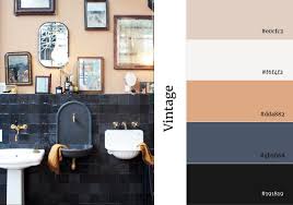
Using a monochromatic color palette, you can use accessories like throws and pillows to add texture and interest.
Things like art and furniture can also be used to add color without taking away from the overall unified look. Even when using one color, monochromatic palettes can be used to create a variety of looks. Unlike the neutral scheme, you can use different shades of the same color to create a unique look.
Analogous Color Palette
An analogous color palette uses two to three shades of a similar hue. This gives you the opportunity to use different colors in your room without creating a jarring look. Analogous color palettes are great for adding depth and visual interest without losing the sense of unity that neutral colors create.
You can use furniture and accessories within the same color family to create a cohesive look like the wall color. Or the muted shades of a neutral palette can accentuate bold colors that add personality to your space.
Accented Neutral Color Palette

The accent colors can brighten up the space while still keeping it cohesive with the other neutral tones. You can choose anything from vibrant jewel tones to soft pastels as accents depending on the overall look you’re going for.
No matter which palette you choose, neutral colors offer a great way to achieve a modern and timeless look that will never go out of style.
With various options, you can find the perfect neutral color palette for your space. When the paint color is right, you’ll know it—and your room will look as good as new.
Also read:
- FinTech’s Benefits for Business
- Top 3 Ways Your Business can Utilize Social Media Analytics Data
- Scientists Find Evidence That Ancient Egyptians Were Tripping Balls
Final Words on Picking a Neutral Color Palette
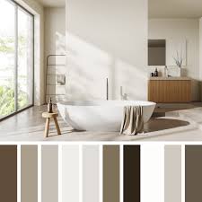
With so many options available from monochromatic to analogous and accented neutrals, there’s something for everyone. Whether looking for an elegant aesthetic or something more playful, neutral colors offer endless possibilities.
So why not give it a try and see what you can create? You can turn any space into a beautiful and inviting home with the right color palette.
Thank you!
Join us on social networks!
See you!