The Undeniable Impact of Web Design On Your Online Sales

Hello!
It’s common for people to believe that the primary purpose of web design is to make a website as visually stunning as possible.
In a sense, that kind of thinking is correct, as web designers do work to ensure that a website is attractive enough to get the attention of users.
With the use of appropriate colors, typefaces, photos, graphics, and other visual elements, web designers regularly come up with websites that look so inviting that people would want to spend time exploring them.
However, to say that website design is all about the aesthetics of a website would be diminishing its importance in achieving the goals of the business for which it was created.
Web design does more than make a website look nice. For one, it helps with SEO for small business sites. More importantly, web design also impacts a business’ online sales significantly.
The Ever-increasing Importance of UX
A website with a visually impressive design will most certainly lure plenty of eyes to its pages.
Getting them to stay long enough to give you the conversions you need, however, will entirely depend on whether they’re having a great user experience or UX while exploring the website.

Simply put, UX is all about the ease and comfort at which a user finds exploring a website, and web design is critical in providing the best UX imaginable.
With great UX made possible by web design, your website stands a better chance of getting visitors to stay longer and purchase the products or services it’s offering. Great UX also typically leads to better customer satisfaction.
You can expect the opposite if your web design dishes out bad UX vibes. Web design-induced terrible user experience will make users leave without hesitation and directly affect your sales.
Let’s take a closer look at some of the UX-related issues that web design can correct to improve sales.
Pages That Take Forever To Load
No one likes waiting forever for a page to load.

So, if a page loads in three seconds or less, its speed would help make users stay, explore your site some more, and possibly buy whatever it is you’re selling.
Page speed should be a top concern for all webmasters, who can make their sites as fast as possible through web design tweaks like avoiding the use of heavy graphics and custom fonts, and optimizing images.
Finding a web hosting company with faster servers would also be a great idea. Here you may find a comparison of some of the best, cheap web hosting services.
Bad Website Navigation
For an Internet user, few things are as awful as getting lost within a website because of an unclear navigational structure.
Users don’t like having to “hunt” for the pages that interest them. They want all the information accessible within a click or two.
To retain visitors and keep them engaged to provide the conversions you need, you must make it easier for users to get to the information they want from your site.
Fail to do that, and people will drop your site like a hot potato and contribute to a higher bounce rate, which can be bad if your website depends on visitors accessing more than one page to succeed.
Some of the things you can do to improve website navigation include
• Dividing categories more clearly and visually—This is absolutely necessary, especially when there are several sections, categories, or sub-categories in your navigation.
• Making clickable navigation elements—Make all navigation elements clickable links, and make them readily apparent to users as well.
• Going with standard navigation placement—Some web designers can get creative with their navigation placement, like using multimedia, but standard placement lends itself better to user experience. Most people are used to finding a site’s navigation and search bars to the top or left of its main page, so put them there so users won’t have to look everywhere for them.
• Creating internal links—Internal links have always been a handy way of helping people get around websites, but some web designers fail to make the hyperlinks stand out from the rest of the body copy, which results to users missing them. If you’re going to put internal links within the body text, underline them, color them differently, or do anything that will make them hard to miss for the user.
Too Many CTAs
There’s no doubt about the importance of call-to-action (CTA) buttons when it comes to getting visitors to patronize your offerings in one form or another.
Some websites, however, engage in a CTA free-for-all on one landing page.

It’s an entirely different story if your landing page has two or more CTAs that egg on people to do different things like “Download My ebook Now!,” “Subscribe To My Blog,” and “Talk To Sales.”
With multiple CTAs with different conversion goals competing for their attention on one page, visitors will likely end up distracted, confused, and annoyed to the point of leaving your site, which doesn’t bode well for your conversion and sales goals.
As much as possible, stick to one clearly-defined, and highly visible CTA on your landing page. If you decide to go with more than one CTA, you should at least make sure that they’re all working towards the same conversion goal.
Long-Winded, Clunky Checkout
There are plenty of reasons people shopping on e-commerce sites abandon their carts.
Some do it because shipping costs are too high, while others are turned off by slower than usual delivery times.

According to statistics from the Baymard Institute, long-winded and clunky checkouts force 18% of online shoppers in the United States to abandon their carts.
Every e-commerce site would do well to simplify and streamline its checkout process.
If you’re running one, have your web designer create a one-page popup checkout page instead of multi-step checkouts. That way, customers will find checking and editing their orders easier and quicker.
With a streamlined checkout process, your business stands a better chance of reducing cart abandonment, which will lead to improved sales.
Mobile-Unfriendliness
M-commerce or mobile commerce is projected to generate trillion in sales in the next years.
To improve their chances of getting a share of that pie, businesses should make their websites more mobile-friendly.

For now, going for responsive design is what will make your website mobile-friendly, if it isn’t already.
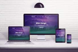
With responsive web design, your website will render well on a screen regardless of its size.
Without responsive design, users who come across your website on their mobile devices will be forced to do a lot of pinching and zooming just to see whatever it is you’re offering.
Truth be told, many won’t even bother doing any of that at all. They’ll just abandon your site and move on to a more mobile-friendly one.
If you don’t want to miss out on mobile users' business, make responsive web design a priority now.
Unattractive and Outdated Visual Design
We’ve been hammering the idea that the user experience will dictate whether visitors will spend more time exploring your site or bug out as soon as possible.
However, you will still need to catch their eye in the first place before they can get the user experience that will help them decide whether to stay or go.

It could be contrasting and loud colors, a cluttered layout, or inappropriate fonts (Comic Sans on websites with serious themes, anyone?) that will instantly drive people away.
A website that looks like it never saw a design update since it launched in the 1990s will also turn off potential customers.
Your Next Steps to Optimizing Your Web Design
Human beings are visual creatures. No matter how much we emphasize user experience in web design, web designers should always strive to make their creations look visually appealing to attract more eyes that will hopefully become customers.
There are many other factors that could impact your online sales. Good or bad word of mouth about your products and services, better offers from competitors or the state of the economy, in general, all affect your sales one way or the other.
Considering how crucial it is to the user experience, you should count web design among those factors.
Take a closer at your web design today and see if it provides the kind of UX that will get people to patronize whatever it is you have to offer.
- Boost Your Web Design With Effective Landing Page Creation
- The Power Of Web Design: How A Great Website Can Boost Your Small Business
- How Web Design Can Affect Your Online Sales?
- Analyzing the Impact of Video Backgrounds: A Trend in Web Design
Thank you!
Subscribe to our newsletter! Join us on social networks!
See you!