How to Use Color to Increase Conversion Rate
Hello!
The stimulation that your eyes get from seeing different shades and hues can become automatic and reflexive over time, though, which is why a lot of consumers take for granted how colors actually influence their lifestyle and habits significantly.
If you’re a business owner, online marketer, or both, you need to understand the fundamentals of color psychology and how you can maximize it for your website to increase conversions. Before establishing the connection between the two, you first need to know what color psychology is all about.
What is Color Psychology?
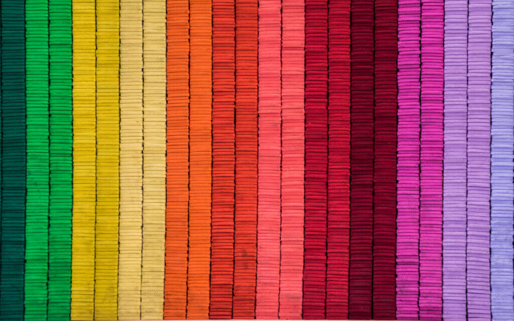
You may have already witnessed how certain colors evoke specific emotions or associations. For instance, red is typically seen as a stimulant. Major fast food companies may be using this shade for their logos and branding to stimulate the appetite of customers.
On the other hand, green is generally associated with nature. That’s why eco-friendly brands utilize the color for their companies.
Carl Jung is one of the prominent psychiatrists that are credited for adding to the study of color psychology.
He believed that artistic expression through images and colors can aid a patient’s recovery from trauma. He also once stated how the human subconscious speaks and comprehends the language of colors.
Color My Marketing
Some may argue that color perception can be subjective, especially across cultures. Nonetheless, there are associations that are relatively consistent regardless of background, gender, and race.
As one example mentioned above, red is generally used to stimulate appetite and strong emotions.
These days, if you want to reach your target audience, you have to develop a viable digital marketing campaign. Your website has become a primary tool for attracting and retaining the interest of potential customers. It’s vital that you utilize all strategies at your disposal to maximize the visual impact of your domain.
Think of your website as a digital storefront. Similar to a physical shop, you want people to actually come inside your domain so that you can market to them directly. This way, you can provide first-hand information on your products and services, which can then boost your chances of making a sale.
Colors and Conversion Rates

This rate pertains to the percentage of web visitors that perform a desired action. It doesn’t necessarily entail making a purchase, although that would be highly desirable, of course.
Generally, this information refers to the interactions that your domain receives from web users.

- Answering a form
- Contacting your company through calls or chat
- Downloading software or media
- Signing up for your newsletter or some other subscription
- Registering for your membership program
- Upgrading their subscription or service
- Using your software or app
- Engaging with your website

For instance, if you had a total of 10,000 visitors last month and 2,000 signed up for your monthly newsletter, you’d have a conversion rate of 20 percent.
Knowing how to calculate and analyze this data can help you assess the effectiveness of your marketing strategies accurately. Plus, the information you glean can also aid you in making better decisions for the future of your company.
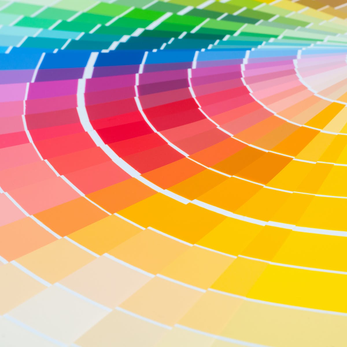
To take advantage of color psychology for your website’s conversion rate, you need to know how the general public perceives different hues:
Advantage of color psychology
1. Red

When paired with another color, it stands out so much that it’s used to emphasize the site elements where you want to direct the eyes of web visitors.
On the other hand, this shade is also associated with danger, so you might want to be careful with its usage.
2. White
In Western culture, white evokes feelings of innocence, cleanliness, and goodness. However, it also signifies death in other Asian countries. Knowing this, you should determine your target audience and utilize this color accordingly.
Nonetheless, it’s very useful for breaking sections and elements. Prioritize having ample white space in your website to give it a sleek and sophisticated look. Doing this will also give web visitors’ eyes some room to breathe and digest the information that they receive.
3. Orange

4. Yellow
Yellow is considered as the happiest color in the spectrum, which may be because it’s associated with sunshine. It promotes positivity and optimism. You can use this hue as an accent if it matches the rest of your color scheme to infuse some cheerfulness and good vibes into your web pages.
5. Pink
With prominent brands like Victoria’s Secret and Barbie using this color unabashedly, pink has become associated with femininity. If you have a fashion store that caters to women’s clothing, you can take advantage of this shade to appeal to your target audience.
6. Blue
You can maximize the use of this color to position your brand as a trustworthy company. There are those that place their guarantee and trust certifications in blue shades to reinforce their credibility.
7. Green
Green is deemed as the easiest color on the eye perhaps due to its connection with nature. Similar to blue, which is perceived in natural bodies of water, it evokes a relaxing effect on the viewer.
8. Purple
Long before, purple has always been associated with nobility and luxury. This shade can be tricky, though, since using the wrong shade for your marketing campaigns can make your content either look cheap or arrogant. It may be best to use purple as an accent color to draw the eye of visitors.
9. Gray

10. Black
Black is widely used by a lot of brands. For some, it symbolizes power, elegance, and sophistication. Conversely, it can also signify sadness or anger. Black is often used as a contrasting color, especially with white, to improve the readability of your site’s content.
ADA Compliance
While colors do influence the buying behaviors of your target audience, you also need to consider and be inclusive of another type of consumer group.

Prioritizing this aspect also affects your compliance with the Americans with Disabilities Act (ADA). This provision requires non-profit service providers and companies with at least 15 employees to ensure that their sites are accessible to individuals with disabilities.
Regardless of whether you’re obligated or not, your brand can definitely benefit from complying with this standard.
With regards to colors, you have to take color blindness into account when publishing visuals. You need to consider people who might view the colors in an image or page inaccurately because of this visual impairment, which renders them unable to distinguish contrasting hues.
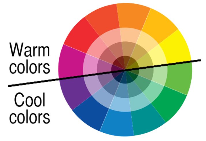
When you don’t take this into consideration, you run the risk of making it challenging for them to make out the various elements of a web page. An excellent way to tackle this is to choose shades that are from opposite ends of the color wheel.

- Green and blue
- Green and brown
- Green and red
- Green and gray
- Green and black
- Blue and gray
- Blue and purple
- Light green and yellow
Also read:
- How To Make 5K Dollars In A Month?
- How to Develop Your Company’s Learning Culture in 2025
- EdrawMax Review – Online Diagrams and Charts Editor
Takeaway
Colors play a crucial role in how consumers perceive your brand. You must pick the right shades to use for your company. Make sure that it aligns with your mission and vision. Moreover, these hues also influence how well web visitors receive your messaging and increase conversions for your website.
Thank you!
Subscribe to our newsletter! Join us on social networks!
See you!