How to Optimize a Landing Page for Conversions

Hello!
Setting up a landing page is a useful way to funnel website visitors to specific content, or get them to make a purchase. As the name suggests, this is the place where your visitors will “land” from their original location.
If you’re making a compelling offer—like a great product at a good price—the conversions should come naturally. But most of the time, you’ll need a little extra help.
You’ll need to optimize that landing page for conversions.
Principles of Conversion Optimization

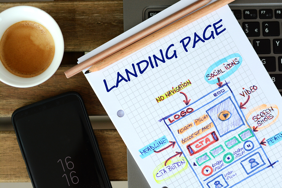
Design: First, you’ll need to focus on the design of your landing page. Your best bet is to hire a professional landing page designer; by hiring a professional, you’ll get access to more resources and years of expertise. Your landing page will look more aesthetically pleasing and will be designed in a way that naturally leads visitors to take action.
Copywriting: You’ll also need to think about the writing you have on your page. An impactful headline can immediately call users to action, while a lackluster one could turn them away. You’ll also need to add descriptions of your product (if you’re selling a product), and optimize your call-to-action (CTA) with the right text.
Offer optimization: Almost all landing pages are designed to make some kind of exchange. You might be asking customers to pay for a specific product, or you might be asking them for their contact information in exchange for a downloadable eBook. Either way, you’ll need to work to ensure that this offer is attractive to them; otherwise, they won’t proceed with the deal.
Specific Strategies for Conversion Optimization
Within those categories, you’ll want to follow these important strategies:
Improve your offer
Most conversions are a kind of trade. Your users are giving you money in exchange for a product, or they’re giving their personal information in exchange for a free piece of content. Whatever the case, you can increase your effective conversion rate by making this exchange more favorable. You can include freebies, lower the price, or make your content more exciting to improve your conversion numbers.
Keep it short and simple

Use minimalistic design
Similarly, you should keep the design relatively sparse. If your page is a baroque mess of different images and competing design elements, your users won’t know what to do. Minimalistic designs also tend to be more aesthetically pleasing, so allow plenty of white space between things like images, headlines, and calls to action (CTAs).
Create a compelling headline
Even if your user doesn’t read all the text you have to offer, they’ll almost certainly read your headline. This is your chance to capture their attention and encourage them to read further. Accordingly, you should spend a disproportionate amount of your time making sure this snippet of text really lands. Headlines are much more powerful when they utilize strong action words or describe some kind of benefit, rather than offering a flat description. For example, the phrase, “Our facial cream is the best on the market” is a flat statement. By contrast, “Get rid of wrinkles in 48 hours with our facial cream” pointedly describes the benefit you’ll receive by using this product, and also incorporates a strong action word.
Use bullet points to further describe your product
If you’re tempted to offer further descriptions of your product, don’t try to stuff more headlines in; one or two headlines per section should be more than enough to capture user interest. Beyond that, consider concisely recapping the benefits of your product or its greatest features in a series of bullet points. Bullet points are aesthetically clean, easy to read, and yet offer you the space you need to elaborate.
Show your product in action
If possible, try to show your product in action. It will be much more persuasive to people on the fence about moving forward. For example, you might have a short video clip showing someone benefiting from using your product, or you might have a series of photographs that show your product in use. If you’re offering services, rather than products, or if you’re offering something intangible, this may be harder to pull off. Instead, consider including images of people who you’ve helped in the past.
Offer a way to learn more

These people can be difficult to convert, but one effective strategy is to include links to further reading. For example, you can link to the main product page of your website, or link to additional user reviews. Links don’t take up much space, so they shouldn’t interfere with your core design, but they’ll offer more information to the people who want them.
Make your call to action (CTA) obvious
Too many novices design a landing page with a CTA tucked away in the corner. If you want people to find it and use it, you have to make it obvious. Even if it seems obnoxious, a gigantic red button in the middle of the screen is much more effective than a CTA that blends into the other elements of your landing page. Depending on the structure of your landing page, it might even behoove you to have multiple CTAs—one for each section, or one at the top of the page and one at the bottom of the page. Now is the time to use CTAs effectively to increase your sales!
Use more contrasting colors
There’s much debate as to which colors are “best” for securing more conversions, but one thing is indisputably true; contrasting colors work well for drawing user attention. Try to use stark contrasts to get attention on specific elements of your page. For example, if most of your page has a light blue hue to it, try a bright orange to really stand out.
Imply urgency

Imply scarcity
You can also increase conversions by implying scarcity. Is this a rare find, or is it limited to a certain number of users? Depending on the nature of what you’re selling, this may be easy or next to impossible. For example, you might be able to convince users that you’re only making your eBook available to the first 500 users to sign up.
Increase trust
Increase conversions by increasing trust. You can do this in a number of ways, such as including reviews and testimonials from past customers, adding “trust badges” that show your affiliation with trusted organizations, or even just including a headshot and brief bio.
AB Testing and Experimentation

There are many metrics you’ll need to examine to determine whether your A version or B version is superior. The obvious one is your conversion rate; what percentage of visitors ultimately convert? However, it’s also a good idea to look at time spent on page (which can tell you how engaging your content is) and, when possible, a heat map to see where users are paying the most attention. You may find that the content from one version of your landing page is highly engaging, but people spend more time looking at a compelling photo from another version; combine these, and you might capitalize on the best of both.
Improve Your Landing Page to Grow Your Business
Landing pages lead customers to a specific product, service or offer and encourage them to take action. It is a great way to drive traffic, improve your SEO and build your brand. However, landing page optimization isn’t a one-time process. It’s an ongoing strategy you’ll have to tinker with if you want to be successful. Be prepared to spend time perfecting your design, writing, and offer for your target audience, and eventually, the conversions will come rolling in.
- Boost Your Web Design With Effective Landing Page Creation
- The Power Of Web Design: How A Great Website Can Boost Your Small Business
- How Web Design Can Affect Your Online Sales?
- Analyzing the Impact of Video Backgrounds: A Trend in Web Design
Thank you!
Subscribe to our newsletter! Join us on social networks!
See you