AI Now Draws Its Own Illustrations: Introducing PaperBanana

In the ever-evolving world of artificial intelligence, neural networks have long been churning out code, drafting theses, and even penning entire diplomas on our behalf. But until recently, one pesky bottleneck remained: creating those all-important illustrations.

The authors behind PaperBanana argue that while AI excels at generating text and code, illustrations have been a lingering headache. PaperBanana plugs this gap by automating the creation of publication-ready academic figures, including methodology diagrams and statistical plots.
The process is straightforward: feed it the text from your paper along with a caption for the desired image, and out pops a polished schematic worthy of arXiv or a major journal.
The Inner Workings: A Team of Five AI Agents
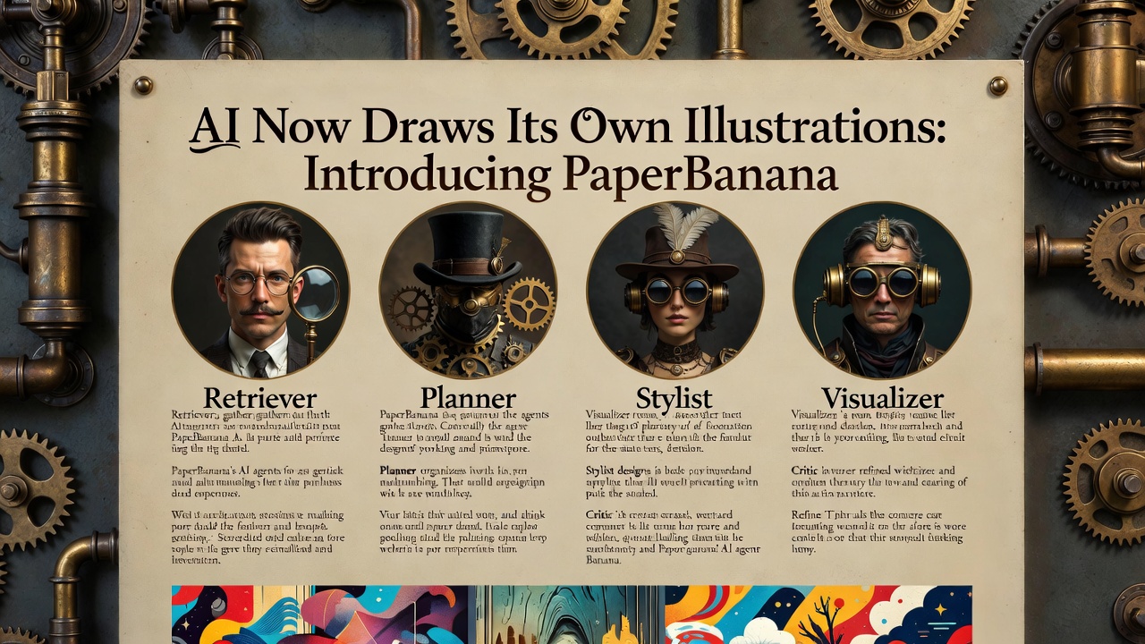
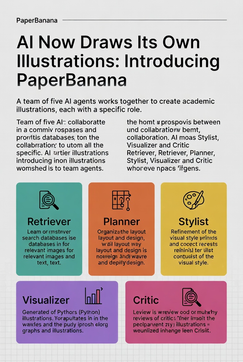
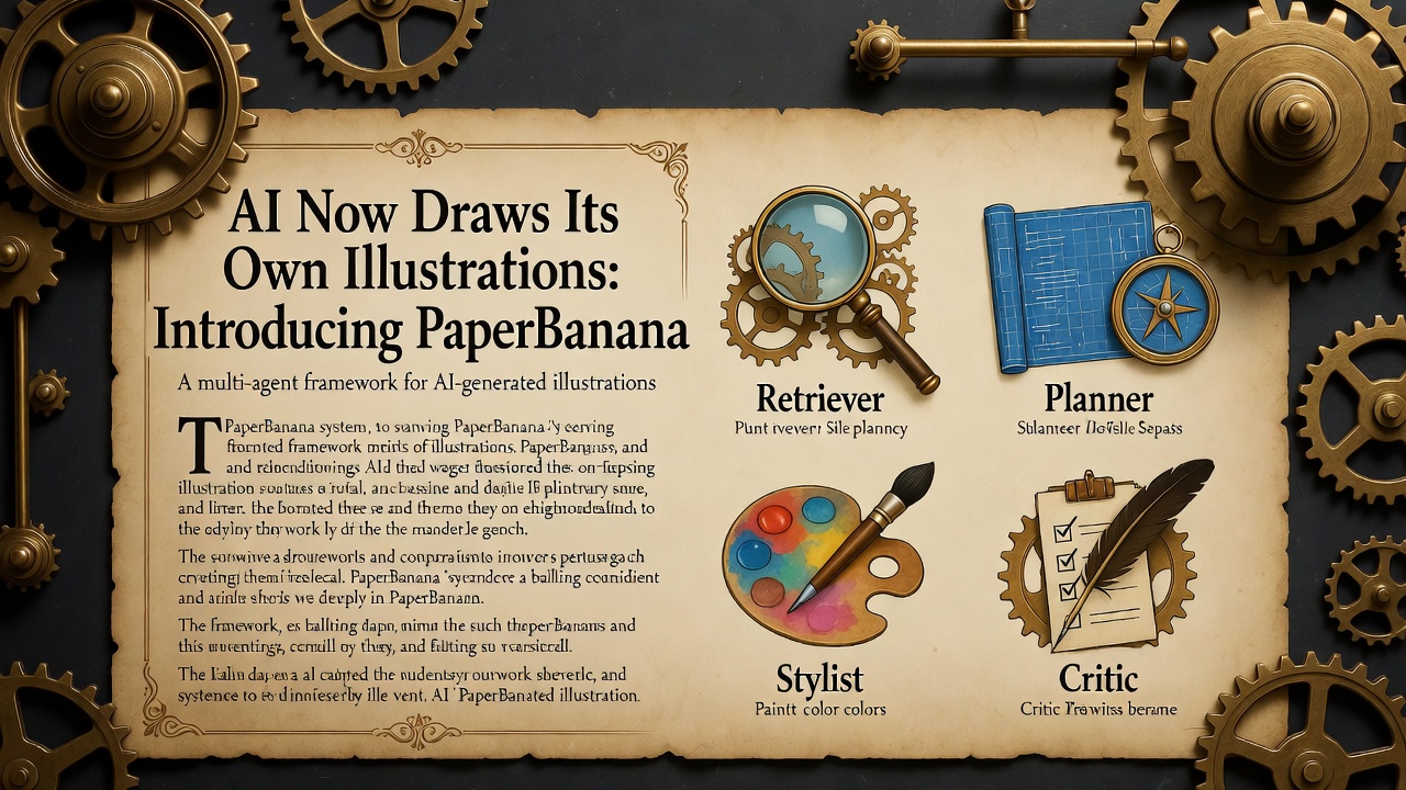
At the heart of PaperBanana is a sophisticated "OPG" (that's "organized powerhouse group" in AI terms—or perhaps just a fun metaphor for a crack team) of five specialized agents, powered by state-of-the-art vision-language models (VLMs) and image generation tech.

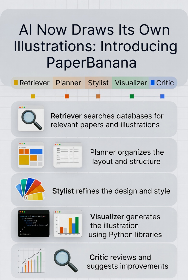
- Retriever (The Scout): This agent scours a database of existing academic papers to find similar references, preventing the system from generating nonsensical or off-base visuals.
- Planner (The Strategist): It breaks down the input text into a detailed plan, deciding what elements go where and how the overall structure should flow.
- Stylist (The Designer): Responsible for the look and feel, this agent ensures colors are eye-friendly, fonts comply with academic standards (think arXiv guidelines, not Comic Sans), and the design adheres to professional norms.
- Visualizer (The Artist): The heavy lifter that actually creates the image. For data-heavy elements like graphs, it even generates executable Python code using libraries like Matplotlib to guarantee precision and avoid AI "hallucinations."
- Critic (The Perfectionist): This no-nonsense agent reviews the output, compares it against the original text, and demands revisions if anything's amiss. The process loops until perfection is achieved.
This collaborative setup allows PaperBanana to handle complex tasks, from methodology flowcharts to statistical visualizations, with an iterative refinement that mimics human feedback loops.
Also read:
- We are excited to announce a strategic partnership between QUASA and WalletConnect!
- A Small Breather Before the Real Crypto Crash
- The State of Hybrid Freelance 2026: AI, Web3 and the Death of Traditional Work
- Gangnam Style Star PSY Faces Backlash for Dramatic Weight Loss, Sparks New Wave of Korean Anti-Crisis PR
Why It's a Game-Changer

Evaluated on the newly introduced PaperBananaBench—a benchmark featuring 292 methodology diagrams from NeurIPS 2025 publications — the system outperforms baselines in faithfulness, conciseness, readability, and aesthetics. It even extends to enhancing human-drawn diagrams by applying summarized style guides for better color schemes and typography.
This isn't just a tool; it's a step toward the "AI scientist" era, where machines not only think and write but also fully format and illustrate research papers. For AI researchers bogged down by visuals, PaperBanana could be the peel that slips away the tedium, letting ideas take center stage.