9 Best SaaS and E-commerce Landing Page Examples to Boost Conversions
Hello!
What makes a great landing page?
That’s a question that we, as SaaS and ecommerce marketers, think quite a bit about. When our clients come to us, they are looking to improve traffic to their site and they are looking to improve the rate at which people turn from browsers into buyers — in other words, the conversion rate.
There are tons of thought pieces out there on the best practices for effective landing pages — we’ve previously written about it here on this blog — so we’re not going to add to that number by talking about hypotheticals! If you’re looking for SaaS landing page best practices or ecommerce landing page best practices, check those links.
So, what worked with these landing pages? What was effective about their design, and how did they draw visitors in? How can you apply the lessons from these pages to your own ecommerce or SaaS businesses? Let’s take a closer, in-depth look.
All of the landing page examples we’re about to display were made using the powerful toolset of Unbounce.
1. Integrify — SaaS Landing Page Example
Integrify is a SaaS solution that promises to offer powerful, flexible workflows and forms to help companies in any industry manage their processes — without needing any knowledge of coding to set things up.
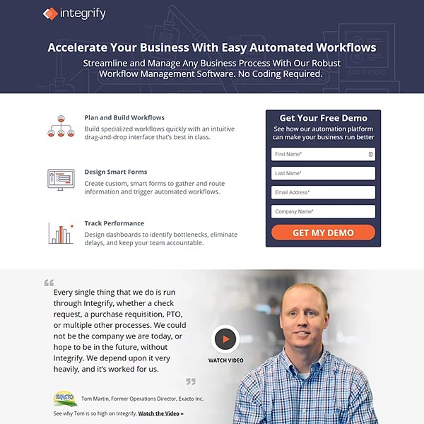
- Clean, straightforward copy. Integrify is a very utility-driven product, and we wanted to highlight its value proposition in an immediately identifiable way. What does Integrify let you do? “Create custom, smart forms” with “no coding required.” How will it benefit your business? “Identify bottlenecks and eliminate delays.” What sets Integrify apart from its competition? An “intuitive drag-and-drop interface.” In three bullet points, that’s Integrify’s entire elevator pitch right there!
- Social proof to demonstrate success. This is one of the elements you’ll see in quite a few of these landing pages. Social proof — real, demonstrable feedback from prior clients that shows how this particular company or solution has helped them — is an invaluable marketing tool. This landing page features quotes from clients detailing the value of Integrify, customer reviews, and an excellent, high-quality video going into depth about how one company found success using Integrify.
- Showing the solution in action. If someone scrolls “below the fold,” which is to say, below what’s immediately visible when you load the page, they’re more likely than not to be at least a little intrigued by what they’ve seen already. Here, we expand upon the value propositions we’ve already mentioned beforehand, and show examples of Integrify in action with short, easy-to-watch gifs. This requires less effort, and less time, than watching a full demo, but also gives more of a sense of how this solution can work for a prospective client.
Through all of this, we clearly tell a prospective lead: Here’s what Integrify does, here’s how it has helped others in the past, and here’s what it can do for you. This means that a lead is far more likely to want to at least see the demo.
2. Seal Skin Covers — Ecommerce Landing Page Example
Seal Skin Covers is an ecommerce brand that offers high-quality all-weather covers to protect your car, motorcycle, boat, jet ski, and so on.
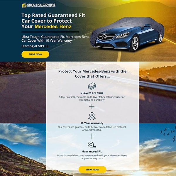
- Immediate action shot. The first thing you see when you load the landing page is a shot of the car cover in action. This is how it’ll look on your car.
- Branding with the proper search term. This particular landing page, as you can see, was for Mercedes-Benz owners (or, at least, people who were searching for car covers for a Mercedes). The Mercedes logo is clearly visible on the front of the car, and the text all refers to the customer’s Mercedes-Benz. For a full campaign of this kind, it’s a good idea to have multiple landing pages; someone who searched for “dodge challenger car covers” would be sent to a different page that could be tailored to what they were searching for. Proper use of negative keywords in paid ads can ensure that this landing page will never show up for someone who isn’t searching for a Benz cover.
- Clear value proposition. In straightforward text (using simple icons to make it obvious at a glance), we lay out what makes Seal Skin Covers worth it: Its quality (“5 layers of fabric”), its relevance to you (“guaranteed fit”) and its excellent customer service (“10 year warranty.”)
- Social proof from real customers. Once again, we augment our marketing copy with authentic customer testimonials. Note that in some of the testimonials, we highlight not just the quality of the car covers, but the quality of the customer service. This was a real point of pride for Seal Skin Covers, and one that we wanted to call out.
One other thing to note: There are multiple purchase points. As a potential customer scrolls down the landing page, they’ll encounter multiple calls-to-action leading to a page where they can buy a cover. This can help you identify which part of the landing page is most effective at making someone want to convert.
3. PerimeterX — SaaS Landing Page Example
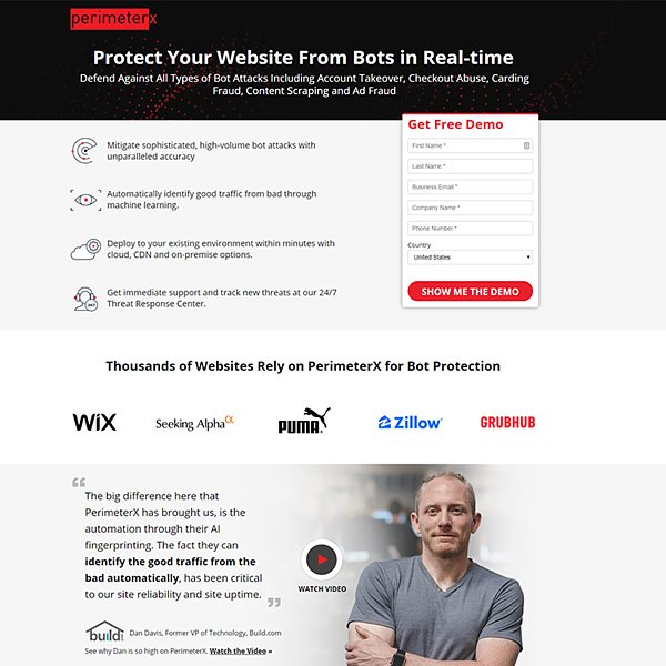
- Clear demonstration of value. The copy is efficient and to-the-point. It lays out PerimeterX’s offering — protecting against “all types of bot attacks” and specifically listing some examples — as well as briefly touching on some specifics, like its use of machine learning and its ability to be quickly deployed.
- Satisfied customers. Once again, we turn to social proof, listing out many prominent sites that use PerimeterX and offering a more in-depth video. Since not everyone is browsing in a place that makes watching video possible, we include a pull quote from the customer and bold the relevant part: PerimeterX helps identify good traffic from bad traffic. It can help you, too.
- Appealing, simple imagery. Each of the icons for the sections below the fold is visually simple, and thus easy to understand at a glance, while not being boring. The little robot with the “X” mark reinforces the anti-bot nature of the software, and is an easily repeatable and thus brandable element. (Plus, it’s kind of cute.)
- Copy that addresses different viewing audiences. Imagine how someone might find this landing page — perhaps a business owner googling “stop bot attacks on your website.” Then, they might send the page to their head IT person, who evaluates the offering on its technical merits.
This landing page has information that is easy for non-techies to understand (“prevent scalpers from snapping up your inventory”) but also includes information that tech workers will appreciate, like “behavioral patterns such as mouse clicks, screen touches, cadence and timing,” which lets more informed viewers know that the PerimeterX team knows what it’s talking about.
4. McEvoy Ranch — Ecommerce Landing Page Example
McEvoy Ranch is an ecommerce retailer of high-quality, small-batch gourmet food like olive oil, jam and honey, and much more. When selling food products, you need to really appeal to a prospective shopper’s base instincts and desires — the sort of thing that makes us watch a food ad and immediately get hungry to, say, order a pizza.
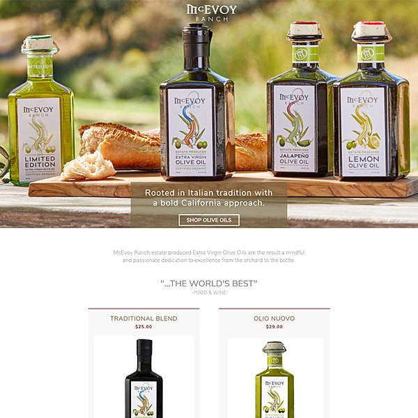
- High-quality product imagery. The very first thing you see when you load the page is beautiful shots of the olive oil and a delicious-looking baguette. Wouldn’t you love to have some of that bread dipped in olive oil? Yum! From the very beginning, a viewer is primed to want the product being sold.
- Clear statement of value. After the delicious-looking product imagery, you get a summation of McEvoy’s mission: Italian tradition, but a Californian approach. It’s specific enough to be evocative, but still leaves you curious and wanting to know more.
- Highlighting the appeal. What’s special about McEvoy Ranch’s olive oils? When you scroll down you get what sets McEvoy apart, its completely organic nature. These olive oils are natural from start to finish.
- Connecting the product with a lifestyle. In addition to more imagery of the olive oil and what you might pair it with, there’s language about lifestyle choices. While this doesn’t fit every client or every landing page, people who shop for organic food are far more likely to care about a healthy lifestyle, so this messaging is an extra push in the right direction.
There’s also some social proof, but it’s highlighting a review quote as well as prominent outlets that have spoken about McEvoy Ranch and its offerings. Do you want some of the olive oil yet?
(Us too.)
5. Julia Morgan Ballroom — Ecommerce Landing Page Example
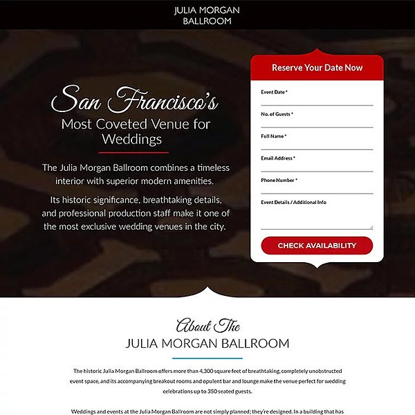
- Imagery and text together. The background image is of the ballroom, warmly lit and ready for partygoers. While you’re reading the text, you’re seeing the ballroom in action.
- Social proof (of a different sort). The page does have customer testimonials of the sort that we’ve seen be so effective on other landing pages, but we wanted to include a different kind of social proof. When calling out that the building has “hosted U.S. presidents, foreign dignitaries, business legends” and more, we drive home what a pedigree this place has — wouldn’t you love to have a shindig there?
- What do planners care about? The information that the landing page calls attention to and highlights the exact sort of things that you’d care about when booking a venue: the location, the food, the amenities. Earlier on the page, we give a more surface-level overview, while going more in-depth with details (like dimensions et al) further down. Those who are still scrolling and still reading are more invested, so they’re ready to hear the specifics.
- The ballroom in action. Rather than just relying on static imagery, the page includes a video showing the ballroom come to life, so you can get a better sense of how everything looks without worrying about if the photos have been retouched.
The Julia Morgan Ballroom is an example of how a business doesn’t have to be a typical “ecommerce” website to benefit from having a great ecommerce-style landing page. Even if you’re not selling products online, the same ecommerce landing page best practices apply.
6. Red River — SaaS Landing Page Example
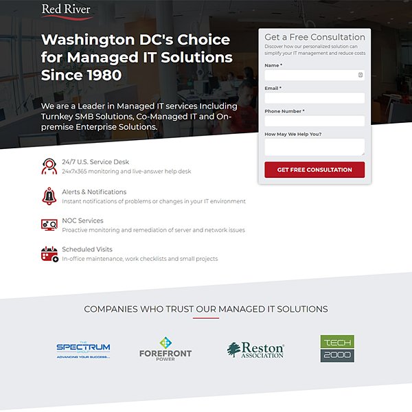
- How may we help you? The last box on the free consultation CTA invites a prospective client to share their issues with the Red River team. This makes it possible for a sales rep to tailor the pitch specifically towards the various needs of a new client, making it more likely that a consultation will lead to a sale.
- Language tailored to the audience. If you don’t know what “NOC services” are, you may not be the person who’s been directed at this landing page. This landing page is tailored more to tech-savvy browsers who may be looking for some extra capacity in the form of an MSP.
- Different clients, different offerings. The language on the Red River page clarifies how it can help clients of varying size, from small businesses to large enterprises.
- Acclaim and experience. You guessed it — another form of social proof! The information on this page shows how long Red River has been active and proves that it has a history of growth and success. MSPs don’t stick around long if they don’t help their customers, after all!
- The core proposition. At the end, there’s no dancing around the point: Red River wants you to know that their offerings will save your business time and money.
7. Kilterly — SaaS Landing Page Example
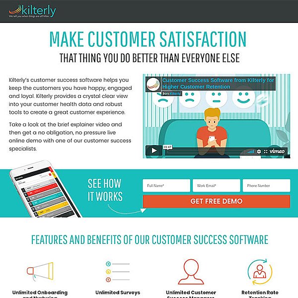
- Colorful and upbeat. The landing page itself is designed in a very cheerful manner. The first thing you see is a video demonstrating Kilterly’s value proposition — it will help you keep your customers happy — and the entire page is designed to continue that tempo. Note that all the icons on the benefits and features are also in Kilterly’s brand colors. There’s no monochrome here!
- Simple CTA. No need for extra fields. Just put in your name, your work email, and you can sign up for a demo. Removing the barriers to entry can help convince people to pull the trigger.
- Different levels of detail. If you’re just browsing the landing page, the section immediately below the fold acts as a quick surface-level explainer of Kilterly’s benefits, like surveys, retention-rate tracking, and more. Someone who keeps scrolling can learn more about the specifics, giving them a more in-depth look. This is something we mentioned with the Julia Morgan Ballroom: The further you go in a landing page, the more interested you can assume a reader is, so you can be a little more in-depth.
- Customer praise. Quotes from delighted Kilterly customers serve as this landing page’s core element of social proof. There’s a nice mix of industries as well, from fitness to computer science and financial services, so it’s easy for a lead to imagine that Kilterly could help solve their customer churn issues, too.
8. Warmly — Ecommerce Landing Page Example
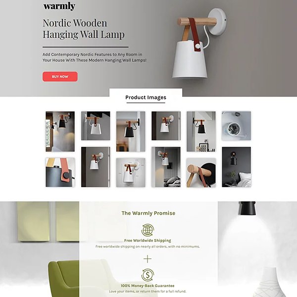
- Showcasing the product. The very first thing you see is shots of the lamp, from various angles, in various colors and environments. Here’s how the lamp could look in your living room, or your bedroom. Since style and coziness is part of Warmly’s core value proposition, clean, appealing visuals are key.
- Buy now. Right now.. If you go to the landing page and decide you like the lamp right away, there’s a “buy now” link directly at the top. You don’t need to scroll down at all! It’s a good way to pick up some potential impulse purchases, or for shoppers who are decisive.
- Why Warmly? The thing about selling decor like a lamp is that the visuals speak for themselves — you either like the look of the lamp or you don’t. That’s why the landing page highlights some of the less-obvious benefits, like free shipping, easy returns, and excellent customer service. There’s no risk in buying this lamp, so why not?
- Details below the fold. As with some of our prior examples, there are further product details when you scroll down, such as assembly and material information. There are also customer testimonials, and similar to the value proposition, these reviews are selected to talk about selling points that aren’t easy to show off in product imagery, like safe packaging, great customer service, and fast delivery.
9. MegaplanIT — SaaS Landing Page Example
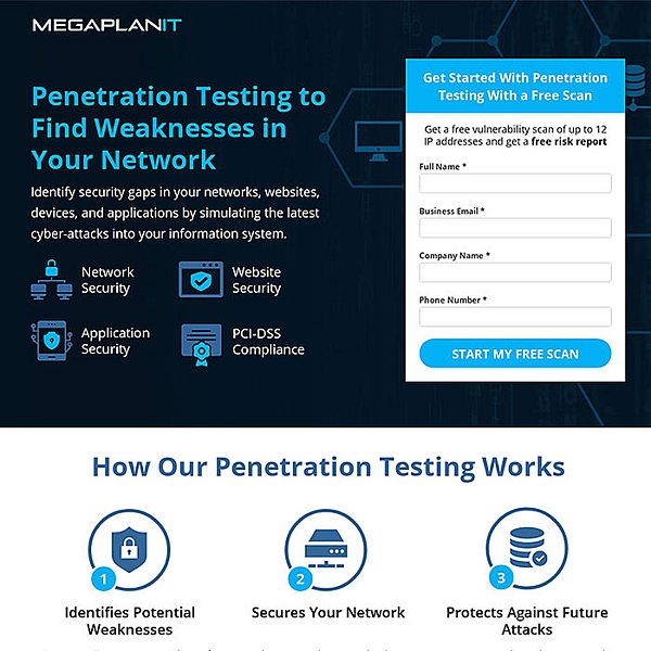
- To the point. In very straightforward, efficient language, we identify what Megaplan IT helps you do: find weaknesses in your network.
- Degrees of explanation. Above the fold, the language is direct and plain; below the fold, we get more into the weeds. Someone with less in-depth knowledge about cyber security might not know what “host-hardening configurations” are, but will see the value in the initial proposition. From there, they might send the page to their tech-savvy coworker who can tell that this page is what their business needs.
- Free scan as CTA. The CTA for this landing page is to get a free scan from Megaplan! That’s an interesting proposition, perhaps even better than just getting a demo, because it’s offering the potential customer something of value that they can use.
Also read:
- The Dawn of Regenerative Dentistry: Scientists Successfully Grow Teeth from Patient Cells
- Lean Startup Definition: The Lean Startup Methodology Explained
- A Guide to Crafting Emotionally Resonant and Relatable Content
Key Takeaways
So there you have it! Those are 9 great landing page examples we’ve made for clients that we’ve seen have proven success. You may have noticed some common themes — these are things that can be very effective.

- Start with simple, effective copy, and get more in-depth as you scroll down. The people who are spending more time on your landing page are more invested in your proposition and, therefore, more willing to learn the details.
- Strong brand imagery, whether it’s videos, product photos, or effective icons, can help draw the eye to elements you want to highlight.
- Social proof is everything. Whether it’s reviews, customer testimonials, case studies, or more, make it clear to the world that people are using or buying what you’re selling — and they’re finding value in it.
Thank you!
Join us on social media!
See you!