A Polished Website Can Still Miss WCAG and Core Web Vitals
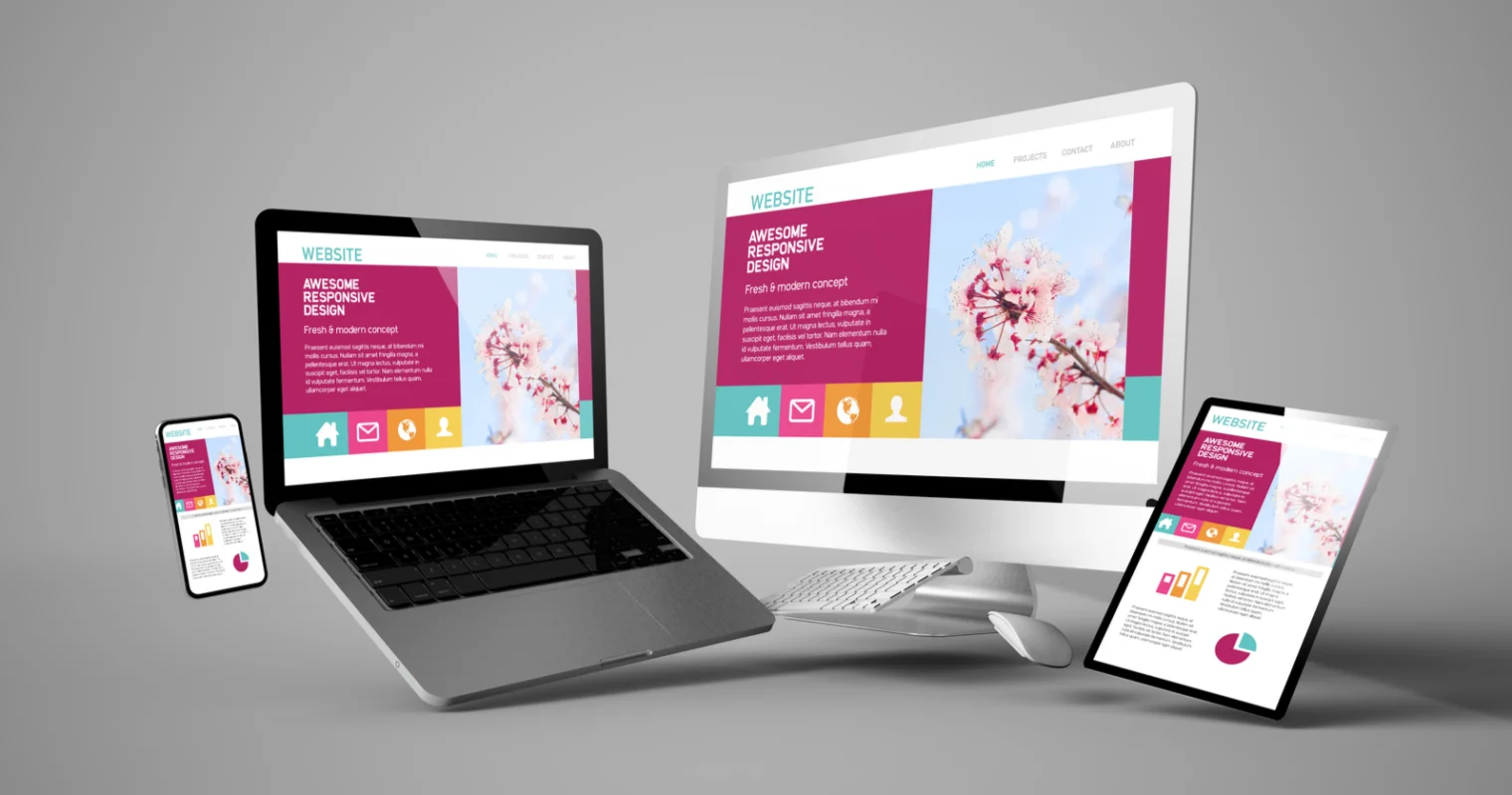
A website can look polished and still fail people who cannot operate its controls, read its content or complete its main task. Clear navigation, readable typography and responsive layouts remain essential, but the accessibility benchmark has advanced: the W3C overview of WCAG encourages use of WCAG 2.2, while noting that WCAG 2.0, 2.1 and 2.2 remain existing standards.
Performance is also judged against more specific criteria than whether a page merely feels fast. The documented Core Web Vitals thresholds classify a good experience at the 75th percentile as Largest Contentful Paint of no more than 2.5 seconds, Interaction to Next Paint of no more than 200 milliseconds and Cumulative Layout Shift of no more than 0.1. Together, accessibility requirements and performance measurements turn broad design advice into testable release conditions.
Do design around one clear user task
Every important page needs an identifiable job. A creator’s home page might direct visitors to recent work, a newsletter landing page should explain the offer before requesting an email address, and a product page should help a buyer evaluate an item. When several actions receive equal visual weight, visitors must decode the interface before they can use it.
Choose the primary action during content planning, before decorating the interface. Give it a descriptive label such as “View membership plans” or “Download the media kit”; repeated labels such as “Learn more” become difficult to distinguish. Secondary actions can remain available without competing through identical size, color and placement.
Don’t measure usability by click count alone. The familiar “three-click rule” is too crude to serve as a design requirement. A short path can still be confusing, while a longer, clearly labelled sequence may be easy to follow. Test whether people can predict where a link leads, recognize their current location and recover from a wrong turn.
Do let content determine the responsive layout
Responsive design is not a collection of smaller desktop mockups. Begin with a logical content order, flexible components and adequate room for controls, then change the layout where content becomes cramped, excessively wide or difficult to scan. This approach accommodates window sizes that were never represented in the original designs.
MDN’s media-query guidance recommends adding breakpoints where the content begins to break instead of targeting a catalogue of device dimensions. Media queries can also respond to environmental characteristics such as whether the primary pointing device is coarse.
Don’t hide essential material to simplify the mobile composition. Navigation, account controls, pricing details, validation messages and legal information must remain discoverable. Review zoomed text, long translations, landscape orientation and keyboard navigation as well as preset viewport widths.
Do treat accessibility as a release condition
Accessibility cannot be added reliably through a final contrast scan or an automated score. Use semantic headings in a logical order, associate labels and instructions with form fields, provide text alternatives for meaningful images and ensure every interactive feature works from a keyboard. Visible focus must remain easy to locate, including when sticky headers, consent notices or dialogs are present.
Color should support meaning rather than carry it alone. Error fields need explanatory messages, selected states need non-color cues and text needs sufficient contrast against its actual background. Videos require appropriate captions, while audio and motion should not begin unexpectedly; nonessential animation should respect reduced-motion preferences.
Don’t confuse automated testing with conformance. A scanner can identify some missing labels, structural problems and contrast failures, but it cannot determine whether alternative text conveys an image’s purpose or whether a checkout sequence is understandable. Combine automated checks with keyboard review, screen-reader sampling and task-based evaluation involving disabled users when the project permits.
Do budget performance before visual effects
Performance decisions begin with the design system and content model. Large hero media, multiple font files, embedded players, analytics scripts and client-side interface libraries all consume bandwidth or processing time. Establish budgets for image weight, script execution and font variants before templates are filled, then require additions to justify their cost.
Measure representative pages under realistic conditions and use both laboratory diagnostics and field data when available. LCP reflects when the main visible content appears, INP measures interaction responsiveness and CLS captures unexpected movement. Reserve dimensions for images and embeds, keep critical rendering work lean, and avoid inserting banners above content after rendering has begun.
Don’t optimize only the home page. Visitors may enter through an article, portfolio item, product page or campaign URL, and third-party components can make those templates behave differently. Review high-traffic and high-value page types, including forms and authenticated states; one performance report does not prove that the entire site is healthy.
Do build navigation and forms from familiar patterns
Originality is valuable in illustration, voice and composition, but basic controls should behave as users expect. Links need to appear actionable, buttons should describe their result and a logo used for home navigation should lead home consistently. Menus need meaningful labels and must remain operable without precise pointer movement.
Forms should request only information required for the transaction. Preserve valid entries after an error, explain the correction beside the affected field and do not use placeholder text as the only label. For multi-step tasks, show progress and let people review consequential choices before submission.
Don’t make interruption the default conversion strategy. A newsletter prompt, discount overlay, chat launcher and consent interface can collectively cover content or trap keyboard focus even when each component appears acceptable in isolation. Define rules for timing, frequency, stacking and dismissal, then evaluate the combined experience on a narrow viewport.
Do make maintenance part of development
A usable launch can decay as links break, ownership changes and promotional components accumulate. Assign responsibility for important pages, dates, downloads and redirects. Automated link checking can catch many failures, but editorial review is still needed to decide whether an outdated page should be corrected, archived, consolidated or removed.
Instrument primary journeys so the team can identify abandonment, repeated validation errors and controls that receive no meaningful engagement. Analytics indicate where to investigate but do not explain intent by themselves. Pair quantitative signals with support requests, internal search terms and moderated observation before replacing a working convention.
Don’t launch without a cross-functional acceptance pass. Verify the primary task on narrow and wide screens, keyboard operation, focus order, heading structure, form errors, media alternatives, broken links and all Core Web Vitals. The practical standard is not whether the page resembles its mockup, but whether visitors can understand it, operate it and complete its purpose without avoidable delay or obstruction.
Also read:
Subscribe to our newsletter
Get the latest Web3, AI, and crypto news delivered straight to your inbox.