Contact Form Design: 7 Best Practices You Should Follow

Hello!

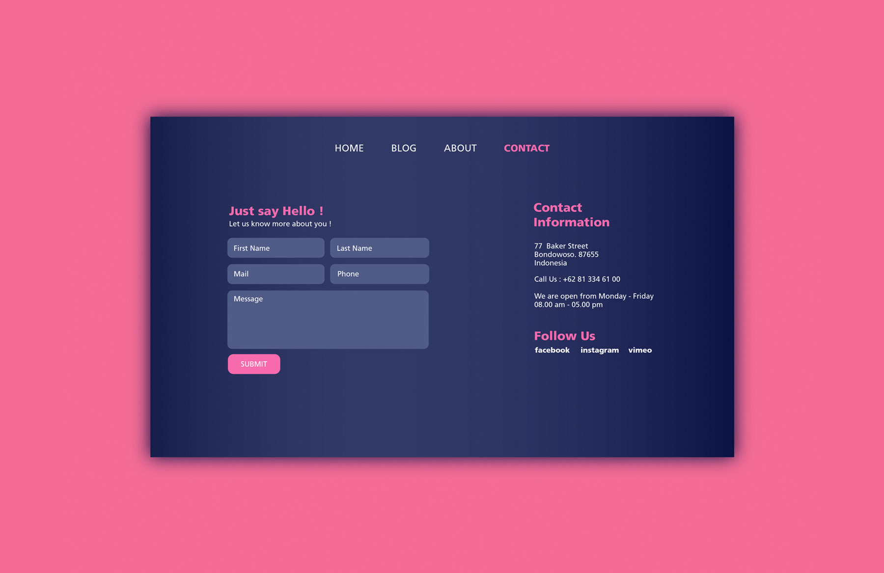
A website without a well-design contact form is incomplete and is not professional in the eyes of site visitors.
In addition, the contact form enables a business to connect with their users and it takes queries, suggestions, and feedback all the time.
Contact forms that are designed from the user experience standpoint tend to have higher engagement rates. Also, these forms play a major role in gaining potential customers and increasing a business’ reputation.
In this article, you will learn the best practices that you should follow to create a well-designed contact form for your website.
7 Web Contact Form Design Best Practices
Many businesses and companies are now realizing the importance of contact forms to get higher levels of engagement and conversions. But most importantly – how these forms serve as a bridge between users and the company. Below are design tips that ensure you get better results from your forms.
1. Use directional cues to guide your website visitors

Most of the time, images of a person pointing to your contact form effectively catches the attention of users. You can also use arrows or shapes around the contact form to encourage users to fill it.
2. Make sure your CTA button stands out
Clicking the CTA or call-to-action button is often the final step that your website visitors will take on your contact form.
This is one of the major reasons why your contact form should be designed and implemented correctly because it influences their decision to actually click.
The text and appearance of the button are equally important and should be designed accordingly. Never leave the default text of the button as ‘SUBMIT’. Instead, you should tell your website visitors exactly what they will get in return by clicking the button on the contact form.

Other ways to make your CTA button stand out is by using color contrast for the button, increasing the sides, or making it pop out to catch the attention of the users.
3. Make the title of your contact form easy to understand
A contact form with a proper title conveys what they will get after completing the form. But also the benefits or assistance that you will give them in return. Make your title more of an action statement in the contact form. A simple example can be “Help us improve our product by filling the below form” or “Receive a gift card by providing your valuable suggestions or feedback.” Also, try to make the headings bold with a decent font type.
4. Use proper contrast to design the contact form

Using contrast helps your contact form become more distinguishable through color and brightness.
For example, if you put a primary and complementary color on your contact form, it catches more attention. Similarly, with brightness, if we put a light-colored form against a black background, it will make the contact form pop out.
5. Create an easy to use contact form
Design your form only with the relevant fields clearly showing visitors what they need to fill out in the contact form. You need to understand that straightforward fields encourage user engagement or conversions. Moreover, it decreases the time of the users to fill out the form.
Also, use only specific labels so that it is easy to understand. Make a form that is clear to understand and what information you are asking the user to fill in the given form.
Make an asterisk sign if there is a field that is mandatory to fill. Moreover, it will help provide social media options for the users to access and fill the form.
6. Keep form fields to a minimum
The more the number of fields in your contact form, the less likely for your visitors to participate and fill out the form.
Make sure that you’re limiting the number of the fields in your contact form. If you need further information about themselves, you can contact them later as you earn their trust.
7. Do A/B testing for the contact form

Also, never do a large number of variations on your contact form. So, for example, if some people interacted with form A and while the others interacted with form B, you can easily see which form is converting better.
On the basis of these parameters, you can do comparisons and understand various trends and insights.
This makes it easier to understand which contact form is having the highest user engagement and which one is underperforming. So, it is best to do A/B testing for your contact form.
Conclusion
These are some of the best practices that you should follow while designing the contact form. Also, focus on creating the contact form which is simple but has the potential to catch the attention of the users.
The insights that you collect will help boost your levels of engagement and provide a better user experience for your website visitors. Therefore, focus on building your contact form by following these best practices for optimal user experience and your business’ success.
Thank you!
Join us on social media!
See you!