Tips for Choosing the Right Color Palette for Your Print Ad Designs

Hello!

Colors can elicit feelings, send messages, and draw in your intended audience. Brand identification, readability, and consumer behavior can all be positively affected by carefully considered color choices.
It can be challenging to narrow down your ad’s color scheme possibilities when there are so many choices.
To assist you in making educated judgments when selecting a color palette for your print designs, this piece will delve into some helpful hints and considerations.
Understand Your Target Audience
Think about the age range, gender, interests, and cultural background of your potential customers. The cultural and psychological associations of various hues vary widely. Do homework to determine which colors resonate most with your target audience and use those instead.
Align With Your Brand Identity

You could use color printing services to help you create colored ads. For instance, if your company is geared towards climate change, having green color to represent your brand identity resonates perfectly with the ecosystem.
Use Color Psychology
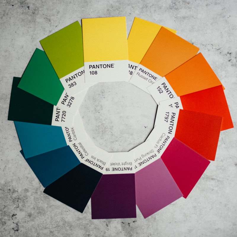
People’s moods and perspectives might be impacted by the colors they’re exposed to. Learn about color psychology to identify the feelings evoked by various hues. For instance, colors like blue and red are commonly associated with specific emotions. Color is essential in your marketing strategy because some clients relate more to some colors and they may turn into potential clients.
Consider Cultural Sensitivities
Keep in mind cultural norms and preferences. Be sensitive to color-related cultural norms if your audience includes people from different backgrounds. Different civilizations sometimes assign various meanings to specific colors. Learn about and honor cultural implications before using a term to prevent causing any offense.
Consider the Context and Purpose
Keep in mind the audience and the reason your adverts are being seen. It’s possible that certain mediums and goals would benefit from the use of various color schemes. You may use bright, clashing colors to stand out in a crowded print publication, whereas a sophisticated product brochure would benefit from a more muted, harmonized color scheme.
Create Contrast and Hierarchy
Make sure your important text and images stand out using a color contrast. Contrast helps draw the eye and direct the mind. Color-coding headlines, CTA buttons, and other prominent features can help establish a distinct hierarchy.
Test and Iterate

Choosing the proper color palette for your print ad designs is essential to making eye-catching, effective advertisements. You may create choices that will resonate with your audience if you consider factors like their demographics, your brand’s personality, and the feelings you want to arouse in them.
Remember that colors can significantly impact how something is interpreted, how someone feels, and how easily they recall your brand. Make use of color schemes and other color theory principles.
Thank you!
Join us on social media!
See you!