Taking a Full Look at the Radar Chart

Hello!

Understanding the Concept of a Radar Chart
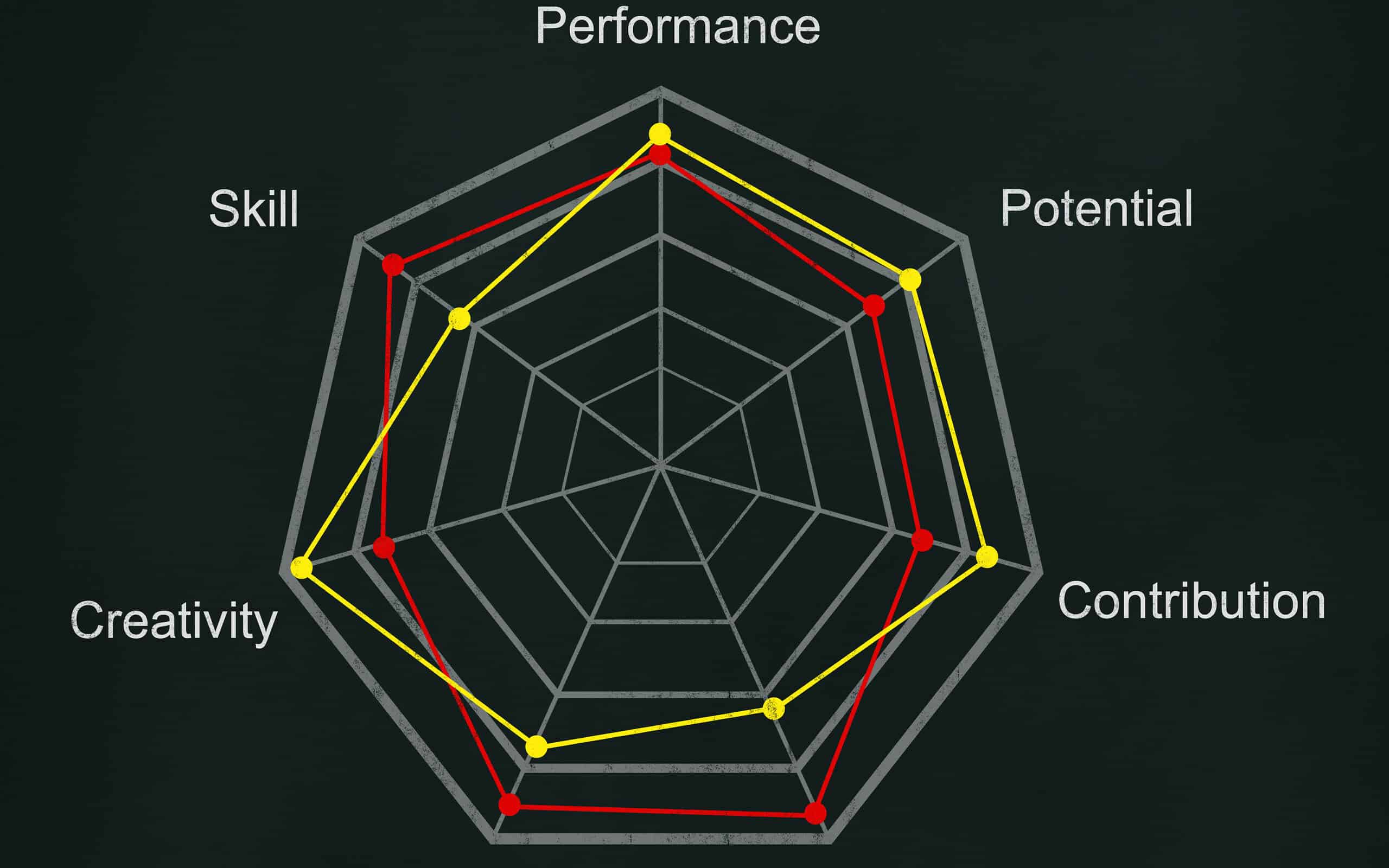
Starting from the basics, a radar chart, also known as a spider or polar chart, provides a multi-variable data display on a two-dimensional graph. Radial lines extending from the center of the chart represent the variables. The data points are plotted on these lines, creating a visually striking graph.
A radar chart is particularly helpful when there is a need to show the total value across multiple fields, or when multiple categories need to be compared. It also facilitates pattern recognition and allows comparisons of similarities or differences in data.
Highlighting the Importance and Indication of Using a Radar Chart

One of the key indications for using the radar chart is when there is a need to compare the performance of a group of entities over multiple parameters simultaneously. This kind of comparison can reveal not just absolute performance but also relative strengths and weaknesses.
Elements and Characteristics of a Radar Chart
The radar chart comprises several key elements that help visualize and interpret multiple variable data. The sizes and axes on the chart can display several different variables at once, providing a comprehensive view of data in a condensed format.
However, one characteristic of the radar chart to be aware of is the way it represents scale. Due to its circular format, the scale can sometimes be distorted, representing a skewed view of the data. This is where the appropriate usage of a radar chart comes into play.
Practical Uses and Applications of Radar Charts

In the field of education, radar charts can lend themselves well to student performance analysis across various subjects. They are also prevalent in the environmental sector to visually illustrate different weather parameters over specific periods.
The Pros and Cons of Utilizing a Radar Chart
While radar charts can provide multi-parameter data visualization and lend themselves well to a comparison of data, they also have some limitations. Like any data visualization tool, understanding when and how to use a radar chart is essential.
Firstly, one of the unique strengths of a radar chart is its ability to visually represent multiple variable data. That said, when there are too many variables, the chart might become cluttered and difficult to interpret.

The key is to use radar charts when the data and the audience warrant it. This can be a powerful visualization tool when used judiciously and accurately.
Thank you!
Join us on social media!
See you!