4 SaaS Landing Pages That Turn Product Complexity Into One Clear Next Step
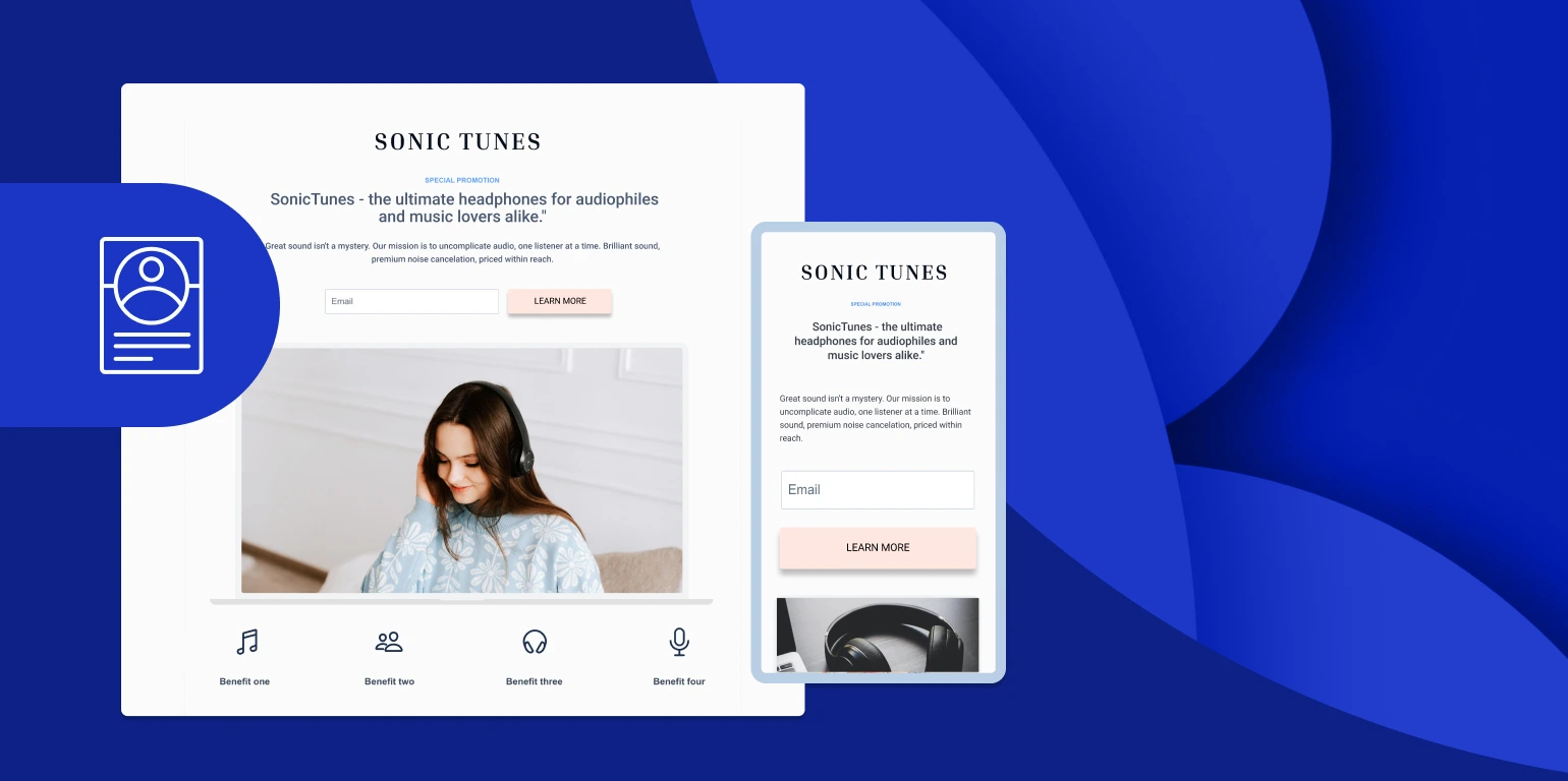
Strong SaaS landing pages still reduce a complicated product to one understandable promise and one appropriate next step. What has changed is the evidence expected around that promise: current examples increasingly demonstrate the product, address a defined buyer and let visitors experience value before making a larger commitment.
This updated selection replaces dated examples with Typogram, Clay, Audienceful and Storylane. Together they show four distinct ways to clarify a SaaS offer: demonstrate the workflow, visualize the transformation, display authentic output or make the product itself part of the pitch.
What “works” should mean for a SaaS landing page
A polished page is not necessarily an effective one. The useful test is whether the page preserves a coherent path from the visitor’s reason for arriving to the action the business wants: the headline identifies a relevant outcome, the visual evidence makes that outcome credible, and the call to action asks for a commitment that fits the visitor’s readiness.
This alignment matters especially when a page receives paid traffic. Google Ads guidance on landing pages says the page should closely match the ad and keywords, mirror the advertised call to action, work well on mobile and make the desired action easy to complete. A generic homepage can satisfy some of those requirements, but a campaign-specific page usually gives the marketer tighter control over the promise and path.
Conversion data also argues against designing only for a large desktop screen. The current Unbounce SaaS benchmark reports that mobile devices produced 79% of SaaS landing-page visits in its dataset, while the category’s median conversion rate was 3.8%. Those figures do not establish a universal target for every product or traffic source, but they make mobile clarity a business requirement rather than a finishing touch.
1. Typogram demonstrates the job before requesting the account
Typogram sells a tool for creating and refining brand identities. Its strongest landing-page device is a product demonstration near the opening: visitors can see someone working through logo details rather than relying on a paragraph that merely claims the software is easy to use.
The lesson is broader than “add a video.” Show the smallest complete version of the buyer’s job. For a design product, that might be the progression from an initial mark to adjustments in spacing and color. For analytics software, it could be the route from raw input to a useful report. The demonstration should resolve a concrete doubt, not operate as a decorative tour of every feature.
Typogram also connects its free-account action to an explanation of what the visitor can access. That proximity matters: the button presents the action, while the surrounding content answers the immediate question of what comes next. A founder borrowing this pattern should place trial boundaries, setup expectations or included capabilities beside the first serious signup request.
2. Clay makes the before-and-after state visible
Clay’s example turns workflow complexity into a visual contrast. Tangled connections lead into a more organized process, giving the visitor a quick representation of the problem and the proposed result. The product is easier to understand because the page illustrates a change in working conditions rather than presenting enrichment and outreach features as an isolated inventory.
This is useful for SaaS products whose value comes from coordinating several tools, data sources or team steps. A literal interface screenshot may be accurate but still fail to explain why the product matters. A before-and-after sequence can supply that missing context, provided the surrounding copy identifies the real workflow and does not promise an unverified performance gain.
Clay’s calls to action are also tied to particular capabilities, including opportunities to explore enrichment or AI-assisted messaging. That is a deliberate alternative to repeating one vague “Learn more” button. The wording tells visitors what they will encounter after the click, while the placement allows different use cases to become entry points into the product.
3. Audienceful uses customer output as the product proof
Audienceful, an email-marketing product, shows examples of emails created with the software. This is a particularly efficient form of proof because the output is what a prospective user ultimately cares about. The page can communicate both the product’s purpose and the quality of a possible result without forcing visitors to decode an unfamiliar interface.
The copy follows the same principle. Short statements frame email creation as approachable, while testimonials add a human account of using the product. Neither element needs to carry the whole argument: the headlines establish the promise, the examples make it tangible, and the customer voices reduce uncertainty.
This pattern suits products that generate a visible artifact, such as a report, presentation, storefront, automation or campaign. Choose an output that represents the target customer’s normal job, label enough context to make it meaningful and avoid presenting an exceptional result as typical. Where confidential data prevents a real example, a clearly identified sample is more credible than an unexplained mock dashboard.
4. Storylane lets the landing page behave like the product
Storylane builds interactive product demos, so an interactive demonstration is unusually well matched to its own offer. Visitors do not have to accept an abstract claim about interactive selling; they can encounter the central experience on the page before registering. The medium therefore supports the message.
A May 2026 Webflow review of SaaS pages documents this Storylane pattern alongside the Typogram, Clay and Audienceful examples. The review also highlights Storylane’s time-specific headline and customer proof, but the transferable idea is the relationship among promise, evidence and action: the page states what the product helps create, provides a working example and then offers a route into the service.
Embedding an experience is not automatically better than using a screenshot. It earns its place when interaction helps answer a buying question quickly and remains usable on a small screen. If the demo is slow, demands instructions or distracts from the primary conversion, a short guided sequence may communicate more effectively.
How to apply the four patterns without copying the pages
Begin with the uncertainty blocking your buyer, then select the proof format. Typogram addresses “Can I understand this workflow?” with a demonstration. Clay addresses “How does this improve my current process?” with a visible transition. Audienceful addresses “What can I produce?” with authentic-looking output. Storylane addresses “What does the experience feel like?” by allowing interaction.
Use that answer to build a compact page sequence:
- Write one outcome-focused promise for a defined buyer and traffic source.
- Choose a product demonstration, before-and-after process, representative output or interactive experience that directly supports the promise.
- Add trust proof beside the claim it substantiates, rather than collecting unrelated logos in a remote section.
- Offer the least burdensome next step that still advances the sale, such as exploring an example, starting a trial or booking a demo.
- Check the complete path on a phone, including form fields, embedded media and the page reached after the call to action.
The four examples should be treated as hypotheses, not conversion guarantees. The right comparison is between versions of your own page serving the same audience under similar conditions. Measure the primary conversion, but also inspect whether qualified visitors complete onboarding, attend the demo or progress toward revenue; a page can increase low-intent signups while weakening the business outcome that matters.
Also read:
Subscribe to our newsletter
Get the latest Web3, AI, and crypto news delivered straight to your inbox.