Roku’s Vision for the Perfect Service Design: New Folders and More Ad Space

While the internet buzzed about Apple’s latest OS redesigns, Roku quietly began testing a revamp of its Roku TV operating system, seemingly hoping to avoid too much scrutiny.

The update isn’t exactly bold, but it echoes trends already tested by Netflix and YouTube.
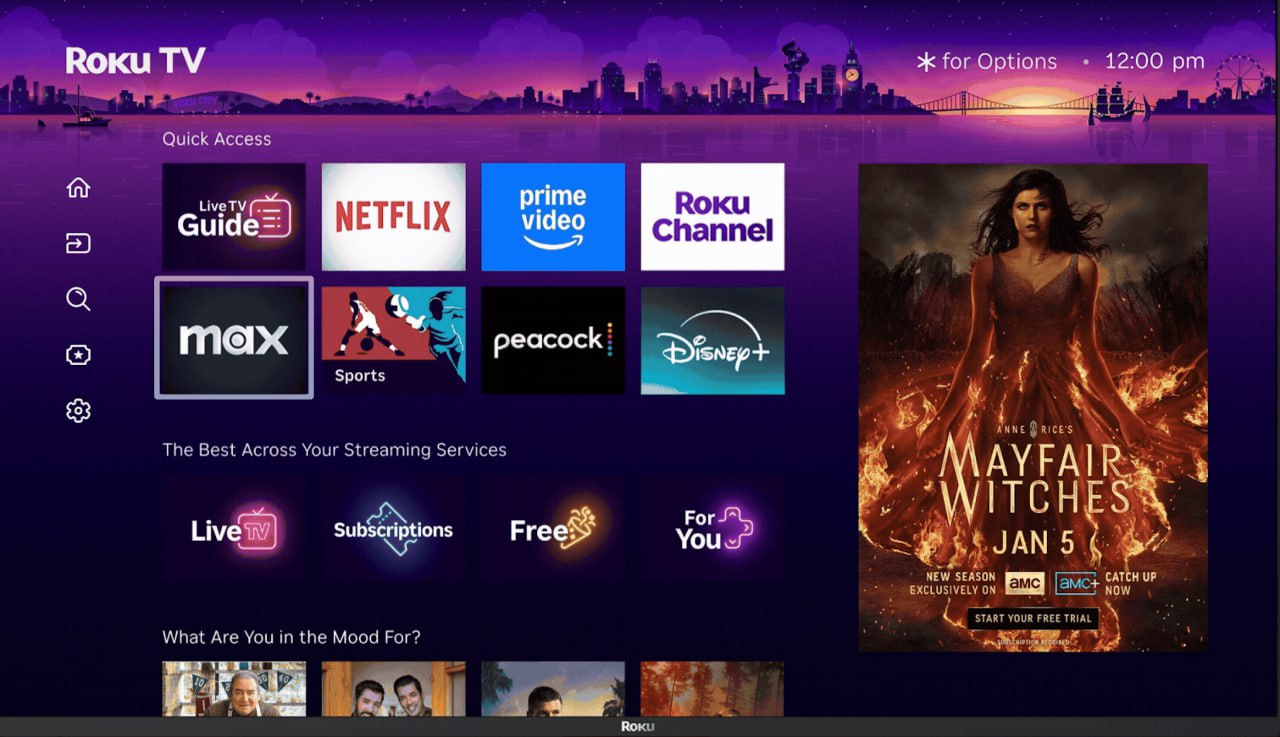
Roku is phasing out its sidebar menu, which apparently discourages users from exploring the main page’s content feed. In its place, there’s a new, non-editable “quick access” tab that automatically gathers frequently used apps.
And, of course, a hefty third of the home screen is now dedicated to advertising banners — a not-so-subtle reminder of who’s footing the bill for free content access.
Also read:
- YouTube’s TV Takeover: What Audiences and Industry Insiders Really Think
- Disney and Comcast Seal Hulu’s Fate: The Streaming Service Becomes Mickey’s by July’s End
- Twitch Bets on Vertical Video Streams to Revive Engagement and Revenue
The redesign feels like a cautious step, prioritizing ad revenue and streamlined app access over groundbreaking innovation. For anyone designing a user interface, take a look at Roku’s approach — and then do the exact opposite.